


Back to Basics: CSS @container Filtering
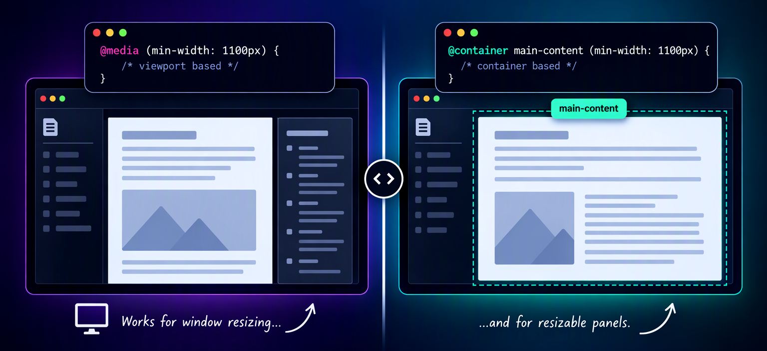
I've been using @media queries in CSS forever, but on a number of occasions these type of Viewport-only limits on width are problematic, especially in UIs that are user resizable or can otherwise dynamically change the sizing of components or panels.
My specific scenario is a resizable panel display where a fixed @media width causes problems due to the container, rather than the window, needs t resizing.
Most of us have likely used the @media at-rule for responsive design, but it's limited to the Viewport width.
There's another, more recent type of conditional CSS at-rule that can be used to restrict sizing: @container which I have been unaware of until recently. @container is a relatively new addition to CSS that was only introduced to browsers a few years back in 2022/23, so perhaps I'm not the only one who got caught unawares that this even exists.

Here's are how the two at-rules differ from each other:
@media
Works off of min/max values of the ViewPort of the host frame.
more info@container
Allows specifying of a Parent Container Name to apply the min/max values to.
more info
The Problems with @media Queries
@media queries are great, when you're dealing with page wide content. If your page consists of a single host container that doesn't change, using @media queries works perfectly fine and it's a staple of Responsive and Mobile First Design. Especially in Mobile layouts that tend to be relatively simple single pane layouts @media constraints are just fine.
But... if you have multiple content panes in your page, or resizable or movable ones at that, @media queries can be too broad of a brush to apply to get the result you need to control nested container content.
For reference @media queries look like this:
.topic-outline {
    display: none;
}

@media(min-width: 1100px){
    .topic-outline {
        position: fixed;
        display: block;
        overflow-y: auto;

        top: 7em;
        right: 1em;
        max-height: calc(100vh - 10em);
        width: 255px;

        font-size: 0.725em !important;
        line-height: 1.4em;

        margin-top: 0px;
        margin-left: 10px;
        padding: 20px 3px 0 20px;
    }
}
The @media(min-width: 1100px) { } block contains a subset of CSS that is applied when the condition is true - in this case if the Viewport width exceeds a minimum of 1100px.
The above CSS is from a specific example from one of my documentation Web sites generated with Documentation Monster, which originally used @media queries in its topic templates used for rendering topics. DM renders the final output into a two-pane view that contains a table of contents on the left and a resizable content pane on the right with a splitter in the middle. The content pane then conditionally displays a left hand sidebar that shows a document outline if the pane is large enough.
The following screen capture demonstrates some of the problems with @media only queries. Keep an eye on the bookmark sidebar ("On this page:") on the right. The intent is that as the content panel gets smaller than a certain size, the bookmark toolbar disappears and reappears as the width expands.
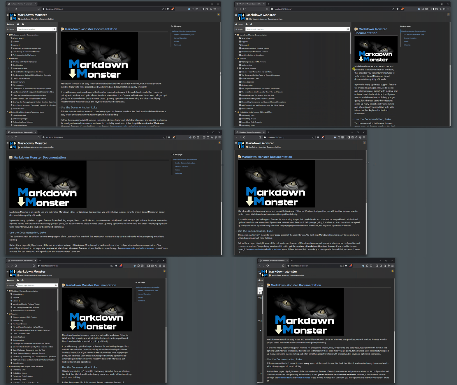 Figure 1 - Using
 @media queries allows sizing per window, which can cause problems if you have resizable content that needs to conditionally render or modify content. Here you can see some inconsistent behavior for the bookmarks sidebar and content pane when then content pane is resized.
If you look closely you can see that the initial full window resizes work properly with the sidebar showing and hiding as expected.
However, resizing with the splitter from a size where the bookmark sidebar shows, to a size where it should hide, you can see the sidebar causing the content to get crunched, rather than hiding the sidebar and allowing the content to flow wider which is the expected and designed behavior. It works with Window resizing but fails with container resizing. Similar behavior shows with the hamburger menu that is showing and hiding the TOC.
This example uses the @media at-rule, and it's misbehaving because the sizing condition is based on window sizing, not container sizing. The result is that in some instances you don't get the right behavior of the sidebar showing or hiding as it should.
Fixing this is not possible with @media queries alone, because it only works as expected when the entire window size changes.
Note that in this scenario the @media query also misrepresents the intent of the size restriction. Specifically in Documentation Monster there's a preview that uses the same HTML but always hides the TOC on the left. So right of the start the @media query sizing in that scenario is off by the 350px or so of the TOC panel. IOW the intent of the sizing here is clearly on the container, not the window, but a @media query alone doesn't really address that. There are ways around that with extra CSS class definitions but that gets messy quick as you have to duplicate many CSS attributes.

@container Queries
The @container at-rule fixes this by explicitly allowing you to specify a container to restrict by for the query condition. So rather than being tied to the window, a @container query is scoped to a specific container.
To get back to the Documentation example shown above here's is the example behaving correctly with the @container query:
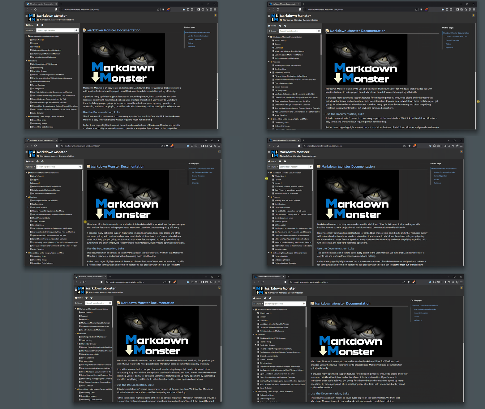
Figure 2 - Using @container queries allows more control by selecting a specific container to apply a media query to. Here you can see the bookmarks sidebar correctly diplaying depending on the content container only.
Notice that now, using the slider or hamburger menu correctly shows and hides the bookmark sidebar as the the sizing is now dependent on the size of the content pane, rather than the size of the window.
Yay.
@container Syntax: A two-step Process
To use the @container at-rule in the same way as the @media query above, is a two part process:
Setting a
container-namein the parent CSS Class
The parent container which is targeted by@containerneeds to be explicitly defined in the CSS with something likecontainer-name: main-contentto be used as a parent in a@containerquery.Applying the
@containerat-rule
Once a container has been defined withcontainer-nameyou can then use it with:@container main-content (min-width: 1100px) { /* css styles */ }The behavior otherwise is identical to a
@mediaquery block including the samemin-width/max-widthrules.
A Space after the Name is Required!
When I originally found out about
, I made the mistake of writing it@container main-content(min-width: 1100px). Notice no space between the name and the()query condition and that did not work. And yes I spent 20 minutes cursing that this feature doesn't work, only to have an agent slap me in the face with the space requirement 😄. So:The space after the name is absolutely required!
@container main-content (min-width: 1100px)
                       ^
No Container Name works too, but...
Actually, the container-name and specification in the @container are not absolutely required. If you don't specify one, the eligible ancestor query container(s) of the style(s) in the CSS block are used for the container it's applied to. So essentially the parent element(s) of each of the styles represented.
This can be pretty arbitrary, and because of that I personally prefer to be explicit and provide a specific container via container-name.
So in this CSS:
@container (width > 920px) {
    .topic-outline {
        display: block;
    }

    .content-pane {
        margin-right: 235px;
    }

    .footer {
        font-size: 0.9rem;
    }
}
Each style's parent container is considered rather than a single container. As you might imagine this can get confusing quickly.
If you don't use a container-name I'd make sure to stick to embedding a single style or at least any styles that have the same parent. Alternately if you want to control several elements, create a new CSS class and apply the container-name to it, then assign the class to all affected elements to be explicit. This avoids confusing and hard to debug scenarios later on.
Applying the @container at-rule
Let's break down the full syntax:
Start by setting a container-name in the container element that the resizing should be based on. I'm using an #id here, but you can point at any CSS selector:
#MainContent {
    container-name: main-content;
    container-type: inline-size;
}
In my case I have an explicit Id for the content container so I used that. If you don't have an explicit CSS style defined that matches your container exactly, you need to create one and add container-name.
Once you have container-name defined in your CSS, you can then reference the it in the @container directive:
@container main-content (min-width: 920px){
   .topic-outline {
       position: fixed;
       display: block;
       overflow-y: auto;

       top: 7em;
       right: 1em;
       max-height: calc(100vh - 10em);
       width: 255px;

       font-size: 0.725em !important;
       line-height: 1.4em;

       margin-top: 0px;
       margin-left: 10px;
       padding: 20px 3px 0 20px;
   }
@container main-content (min-width: 1100px) {
        .topic-outline {
            width: 400px;
            font-size: 0.725em !important;
        }
        .content-pane.topic-outline-visible {
            margin-right: 380px;
        }
    }
}
And that's it!
Summary
CSS @container queries provide a much-needed solution for container-level responsive design where viewport-based @media queries fall short.
With a few very minor changes to the CSS, I've resolved a very long running nagging CSS issue, that I put up with for a long time. At its original inception this issue had no quick resolution because @container didn't exist at the time other than resorting to script code.
But now, with this relatively new @container feature I get the intended behavior with minimal effort and a very simple change path from the original behavior. Nice!
@container was new to me since it is a relatively new at-rule, so it might be new to you too, so I hope this is useful to some of you...