


Making Html Input Controls Truly ReadOnly

Although HTML has support for readonly control content, the behavior is not really well implemented in Web browsers. readonly displays some minimal alternate styling (which you can customize via CSS), but even then the behavior you get is still not optimal because the control is still selectable and stills shows a focus rectangle:
If you just use something like this:
<input type="text" readonly class="image-quantity" />
You get a result like this in a text box (here in a list of images):
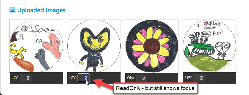
Figure 1 - The default readonly behavior on input controls leaves controls still selectable and show a focus rectangle, even though the text can't be edited.
You can see that the textbox is still selectable with the mouse and you can still tab into it. It still behaves like an edit control, except you can't change the value which is pretty annoying to users.
Some frameworks like Bootstrap do default styling for readonly so you see read only fields that display differently with greyed out or low-lighted content. Here's Bootstrap's default version of that:
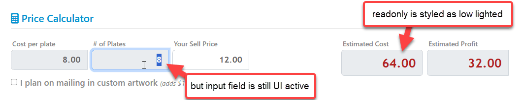
Figure 2 - Default readonly styling often only addresses the display, not the UI activation behavior even though you can't edit the input.
That's good enough for a visual indicator, but unfortunately - as before - the field is still UI enabled, so you can click on it or tab into it to get a focus rectangle. To the user it still looks like the field is editable, even though it is not!

readonly vs. disabled? Do you really want readonly?
Html has both readonly and disabled attributes which from UI and behavior perspectives have many overlapping functionalities and behaviors. disabled actually disables field input and so that would solve our focusability issue. But there are also behavioral differences: Most importantly, disabled controls don't post back their value to the server, while readonly controls do.
So if focus is the only concern, the simplest solution to this problem is to use disabled on the control like this:
<input type="text" disabled class="image-quantity" />
Now the input field becomes non-accessible altogether without any focus from mouse or keyboard.
If both
readonlyanddisabledare present on a control, it's still considered disabled and doesn't post back to the server. The only reason you'd do this is to get styling features of both attributes. Not recommended for the confusion this creates.
The official differentiation between readonly and disabled is defined like this:
"The difference between disabled and readonly is that read-only controls can still function and are still focusable, whereas disabled controls can not receive focus and are not submitted with the form and generally do not function as controls until they are enabled."
MDN Documentation
More specifically:
- A
readonlyinput is submitted but cannot be modified by the user. - A
readonlyinput control is still selectable but cannot be modified by the user. - A
disabledinput is not submitted and cannot be modified by the user. - A
disabledinput control is not selectable and cannot be modified by the user.
Bottom line: I would argue that in most cases where you think you need readonly, you probably want to use disabled instead. I can't see why you'd ever want the hybrid UI behaviors of readonly that still allow you to focus. The only realistic use case I see for readonly is if you indeed need to post the readonly fields back to the server.
For client side code this doesn't matter as you can always assign values to input controls via code or bindings.
So disabled might be the better choice, but if you're like me, that probably isn't your first thought - especially when you're thinking about input controls that run in a dual state. Hey I have control that takes input in one mode, and not in another - readonly seems the natural choice. No - in most cases disabled is likely the better choice.
Fixing Focus: CSS Styling and Html Attributes
Ok, so assuming you do want to stick with readonly we can still fix readonly UI behavior to behave similar to the default disabled behavior of no UI focus, but it takes a little extra effort.
By default HTML base style sheets or frameworks like Bootstrap or Material provide low lighting formatting for ReadOnly controls. But if you do custom control styling like I'm doing in Figure 1 that default read-only styling mostly goes out of the window. In Figure 1 the same styling applies regardless of readonly status of the control.
Thankfully you can override the styling relatively easily with CSS like this to provide better read only behavior:
 .image-quantity[readonly]
 {
     border: none;
     opacity: 0.7;
     pointer-events: none;
 }
There are plenty of visual tricks you can use to show disabled content, from grey backgrounds, to opacity or removing content altogether. I like opacity as in indicator both for read only and disabled content.
The pointer-events attribute is one that's easy to overlook - it's what prevents you from UI activating with a mouse so a click on the field will not activate it.
This CSS gets us most of the way:
- Displays low-lighted to show the read only behavior
- Doesn't allow for clicking into the control to set focus
That's a big improvement!
Fixing Tab Focus
We're not done yet though. There's one more thing that affects the control's focus: Using Tab selection in the page which lets you use keyboard navigation of editable controls. readonly input controls are still included in the default tab order and while you generally don't tab into fields, if you're in a nearby field and tab or arrow through you may still end up on that field with focus at some point.
There's a workaround for this issue as well: You can use the tabindex attribute on Html Input controls to control how tab focus and tab ordering is handled:
<!-- no tab focus -->
<input type="text" readonly tabindex="-1" class="image-quantity" />

<!-- Default tab ordering  -->
<input type="text" readonly tabindex="0" class="image-quantity" />

<!-- Specific Tab ordering  -->
<input type="text" readonly tabindex="5" class="image-quantity" />
The default is 0 which uses automatic tab ordering which is in the order the controls appear on the page. Set at 0 readonly controls still receive tab focus, unfortunately.
You can also provide specific tab ordering where higher numbers are accessed later in the tab order. This really only works well if you apply it to all controls, which isn't always easy to do especially in component based applications where a page is made up of many components and the tab order isn't clear cut unless you very deliberately use a numbering scheme appropriate for each component/page.
Finally the most important value for this post: -1 removes the control completely from the tab ordering sequence so you can't tab into the field.
Put it Together in Html
So now we have what we want via:
- Low Lighted CSS styling
- Disabled pointer events with
pointer-events: none - No tab order access via
tabindex="-1"
 .image-quantity[readonly]
 {
     border: none;
     opacity: 0.7;
     pointer-events: none;
 }

 <input type="text" readonly
        tabindex="-1"
        class="image-quantity" />
If you want to be more generic about it you can also apply the CSS globally so it applies to all input controls:
input[readonly], textarea[readonly]
{
     opacity: 0.7;
     pointer-events: none;
}
Note that
readonlyonly applies on text input controls likeinputandtextarea, not on other controls likeselectorbutton. For those controlsdisabledis likely the better Html attribute to use. Kind of a head scratcher especially forselectwheredisabledwon't post back the value.
Put it together with Conditional Rendering in VueJs
To put this into the practical context of the example I show in Figure 1, let's look at an application implementation that uses dynamic assignment as part of a VueJs client that sits on a Razor page that eventually posts back to the server. So in this case the post back is required in order to make the backend model work correctly.
In the Vue model, readonly display state is determined by an isReadOnly property that is triggered as part of the application depending on operating mode. Basically while in production mode you can change the quantities, once the order is submitted it's read only.
The relevant logic binding both the readonly style and the tabindex Html attribute is:
<style>
 .image-quantity {
     width: 2.3em;
     font-size: 1.3em;
     padding: 0 0.4em
 }
 .image-quantity[readonly]
 {
     border: none;
     opacity: 0.7;
     pointer-events: none;
 }
</style>
...
<input v-model="image.quantity"
            v-on:change="updateQuantity(image)"
            v-bind:readonly="isReadOnly"
            v-bind:tabindex="isReadOnly ? -1 : auto"
            class="number image-quantity"  />
</div>
The rendered plain Html looks like this:
<input readonly="readonly" tabindex="-1" class="number image-quantity">
And that now works:
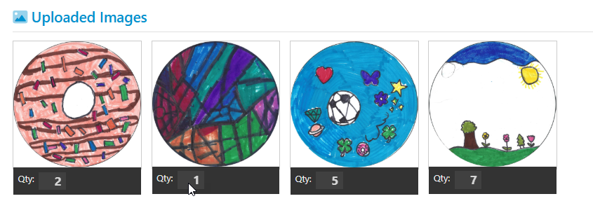
with an unselectable input box. You can still select the text via text selection, but there's no focus rectangle or other highlighting other than the text selection highlight.
Binding Disabled and ReadOnly in Razor TagHelpers
readonlyordisabledare odd Html attributes in that they support dual syntax either as a single word 'switch' (if it's present it's true, otherwise false) or as an assignment value likereadonly="readonly".Razor TagHelper binding only seems to work with logical binding and the syntax has to resolve to
readonly="@true". For expressions make sure to wrap the expression with brackets like this:<input type="number" asp-for="Fundraiser.EstimatedPlates" readonly="@(fundraiser.Status != FundraiserStatus.None)" />

Summary
If you want to get input controls that can be accessed by users you have a couple of options:
- Use
disabledif you can and don't need to submit to the server - Use
readonlyand apply CSS styling withpointer-events: noneand Htmltabindex="-1"
It sure would be nice if default CSS style sheets and even those in some CSS frameworks handled readonly fields better out of the box. At minimum a framework like Bootstrap should probably have a global rule that includes the pointer-events: none:
input[readonly], textarea[readonly]
{
    ...
    pointer-events: none;
}
to at least disallow clicking into the field. That still leaves tabbing but that can't be fixed with CSS. Heck it would be nice if tab behavior could also be controlled via CSS. But alas it's W3C 😄.
As with so many things in Html and CSS there are plenty of solutions to overlooked behaviors like this, it's finding in non-obvious and often disconnected places, that's the hard part.
And it's also the reason for posts about basic topics like this: It lets me find this information in a well-known place in the future. Maybe some of you find it useful too.
Resources
The Voices of Reason
# re: Making Html Input Controls Truly ReadOnly
@Andrew - you can still select and copy text of a disabled control. Not much of a difference there.
# re: Making Html Input Controls Truly ReadOnly
A little bit of script can get the disabled fields submitting with the form. 😃
document.addEventListener("formdata", e => {
    const form = e.target;
    const formData = e.formData;
    // Find all disabled input/textarea elements with a "data-submit-disabled" attribute:
    const selector = ":is(input, textarea)[data-submit-disabled]:disabled";
    form.querySelectorAll(selector).forEach(el => formData.append(el.name, el.value));
});
# re: Making Html Input Controls Truly ReadOnly
What are the a11y ramifications of using readonly vs disabled? If some of my consumers use a screen reader, how will the reader treat a readonly input control vs a disabled input control? Depending on your audience, this may be something else you need to keep in mind.
I'm currently supporting a legacy codebase with many CSS styling changes that were made to create a specific user experience that is in some cases divorced from the semantic HTML. Now that we have a mandate to make our applications compliant with WCAG 2.1 AA, we are having to revisit a lot of these decisions and bring them back to HTML that expresses its intent correctly, and ensuring that keyboard-only users, screen reader users, and standard users all have a similar experience.
# re: Making Html Input Controls Truly ReadOnly
@Kerry - yes that's a very good point. But maybe one more reason why the styling changes might help and leave the original intent of read-only intact. For screen reader behavior I suppose you'd probably leave the tab-ibility alone so you can tab in.
Not the sure what the right behavior for read only is realistically. I mean there are so many options of how that can be handled right:
- read-only
- disabled
- Replace input with plain text or a label
- don't show at all
Lots of options - who's to say which is the right one?
# re: Making Html Input Controls Truly ReadOnly
Readonly is beneficial because you can provide feedback to the user on why the field is readonly. Screen reader users can still interact with the field and if you use aria-readonly=true on the field the user will be given feedback to that. Disabled controls are completely invisible to a screen reader and voice control users cannot interact with them. If you can't see, you would have no idea that a disabled field is there at all.
Pros of Using readonly
- Accessibility: People can still focus on and interact with the content, which is important for screen reader users and those who rely on keyboard navigation.
- Preservation of Data: People can view and copy data without the risk of accidental modification.
- Consistent User Experience: Provides a clear indication that the data is fixed and should not be altered, while still being accessible.
When using readonly you should communicate clearly to ensure people understand why a field is using readonly. Use labels, tooltips, or help text to explain the purpose of the non-editable field.
You should never remove the focus indicator for an interactive element, that violates WCAG Guidelines.
WCAG 2.1, Success Criterion 2.4.7: Focus Visible: This criterion requires that any keyboard-operable user interface has a mode of operation where the keyboard focus indicator is visible. This is crucial for users who rely on the keyboard to navigate, as it helps them understand which element is currently active or selected.
WCAG 2.2, Success Criterion 2.4.11: Focus Appearance (Minimum): This criterion specifies minimum requirements for the appearance of focus indicators to ensure they are visible and distinguishable.
Using disabled
Since disabled fields are only available to a sighted user, two better alternatives are a plain text label value pair like you mentioned, or simply not showing the disabled content at all. If the disabled content is necessary, then you probably want readonly.
# re: Making Html Input Controls Truly ReadOnly
Readonly control still have great feature to copy to clipboard its value, disabled control disallows copy. I prefer .Enabled = .F. and .Readonly = .T. for most cases, especially for long text fields. Still have to use Visual FoxPro 😦 Web have other style and UI rules, agree.