
If you've build mobile Web applications that need to run on iOS Safari and on an iPhone you've probably run into the bouncing Viewport issue, which can occur when editing input fields:
- You focus on a Text Input box
- The keyboard pops up
- The remaining - now shrunk - Viewport zooms in
- The zoomed Viewport hides a bunch of content
- You type your text on the keyboard
- Hit done or click out into the Viewport
...and you find that the zoomed ViewPort state persists even though the keyboard is no longer active. IOW - the keyboard access zoomed in, but the zoomed in state is not ever released unless you:
- manually pinch and zoom back out to 100%
- double tap some empty area in the body content
Very ugly behavior and behavior that seems not uncommon in mobile Web applications (not just mine 😄) and which frankly makes for a real shitty mobile Web experience.
Even worse, the experience seems incredibly pointless. Zooming in on keyboard input doesn't seem to serve a useful purpose. After all you're not actually entering any input into the text field - you're using the pop up keyboard. If the field was too small before zooming, it would be bad UI to just display it inactively. It's likely if the input field is too small to read/view it would get fixed, but zooming into the field on input doesn't make that scenario any better. It only provides annoying behavior that doesn't even revert when input is complete. Grrrr!
The good news is that once you know what causes the problem, the fixes are quite easy to address and that's what this post is about. As so many HTML related odd behaviors that are browser specific the cause of the problem is non-obvious and not well documented so it seems like something that's just the way it works. Well - that's what I thought at least, until I looked a little deeper into the cause.
For those of you too impatient to read a long form discussion here is the bottom line to avoid iOS auto-zooming:
- Use input fields with
font-size: 16px or greater
- Use
maximum-scale=1 in the viewport meta tag selectively for iOS Safari
For more detail, read on...

HTML ViewPort and Sizing
Let's back up for a second. Mobile applications should set the ViewPort size in each page that displays mobile content. This can be done in the one index.html page for a typical Single Page Application (SPA) or each individual page that gets shown in a server rendered application.
The recommended setting for the ViewPort tag in a mobile capable application is:
<html>
    <head>
        <meta name="viewport" content="width=device-width, initial-scale=1" />
    </head>
</html>
This says that the ViewPort - ie. the main display area or body of the document - should use the available device's width, and that the initial scale is at 100% (1 is 100% as a fractional percentage) of the device's width. This results in your content sizing itself to the small mobile screen when it loads. Content fills from edge to edge regardless of the size of the screen, assuming responsive content sizing is applied.
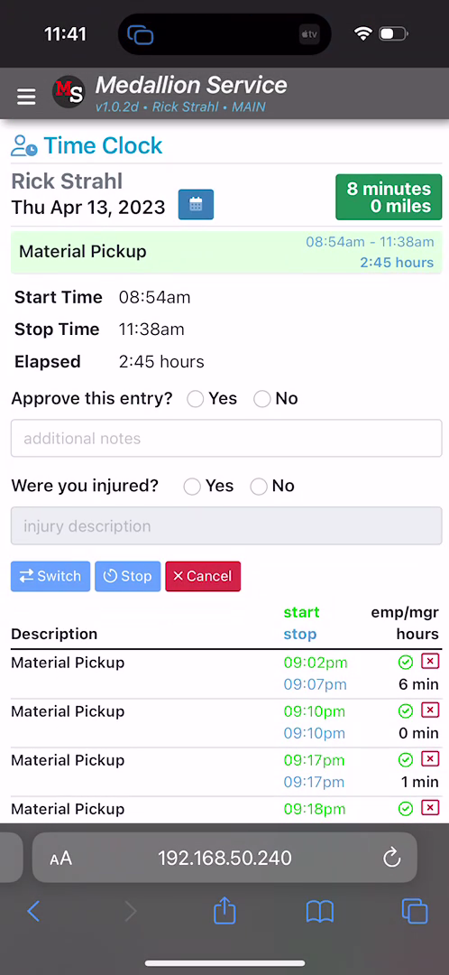
And initially this looks totally fine with the view fitting exactly into the phone's screen width. For example:
But then you decide to click into the textbox and the popup keyboard pops up and at that point - depending on how your page is set up - things might start going awry. Here's what the above app looks like on text input:
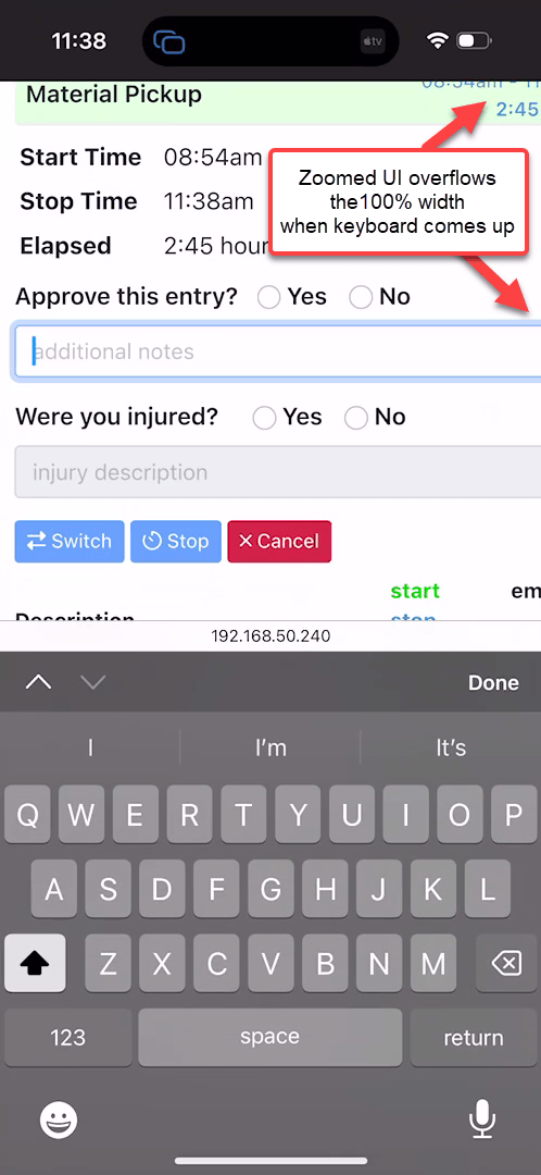
As you focus onto the textbox, the keyboard pops up, but the entire ViewPort now zooms in resulting in a bunch of content overflowing on the right edge. This is annoying as hell, and I'd say one very common reason that many mobile Web applications can feel off and user unfriendly in behavior.
As is often the case in HTML there are solutions that are relatively simple to implement, but figuring out what causes the problem often is not.
The behavior we want is:
- No auto-zooming of textbox input
- All other zooming (pinch and zoom) operations to still work
As to the fixes, there are a couple of ways that this funky zoom behavior can be avoided.
maximum-scale in the ViewPort Meta Tag (selectively for iOS)16px or bigger text (easier said than done)
maximum-scale
The first solution is an easy fix for iOS, but it has to to be selectively applied to iOS or it can cause potential accessibility issues on other mobile devices.
The setting in question is to add maximum-scale=1 to the ViewPort string:
<meta name="viewport" content="width=device-width, initial-scale=1, maximum-scale=1" />
For iOS Safari (> v10) this actually fixes the problem by forcing textbox input not to auto-zoom content on focus. Despite the name and actual designed behavior of the tag - maximum-scale - on iOS you can still manually pinch and zoom and size the ViewPort larger than 100%, but it's now a user initiated operation: No more auto-zooming.
On iOS this is the behavior you want to see and this fixes the auto-input zoom problem on iOS devices. Yay!
Well... not quite so Yay! Unfortunately, Android devices treat maximum-scale as the spec recommends, so it and won't allow pinch and zoom sizing beyond the value specified in maximum-scale. So on Android with Chrome or Chromium style browser (also with FireFox Mobile), maximum-scale=1 won't manually pinch and zoom beyond the 100% bound, which is a serious accessibility problem for people that have vision impairments and depend on zooming content.
In fact, MDN recommends that maximum-scale should not be set under a value of 3 and the default is 10:
maximum-scale
Controls how much zoom is allowed on the page. Any value less than 3 fails accessibility. Minimum: 0.1. Maximum: 10. Default: 10. Negative values: ignored.
Arguably the Android/Mobile Chromium behavior - which doesn't 'auto-zoom' at any size - is the correct behavior: maximum-scale per spec should fix the maximum zoom size for pinch and zoom. So maximum-scale=1 shouldn't zoom beyond 100%. However, iOS Safari ignores this requirement, which can work in our favor for the selective hack described above.
At the end of the day this means that once again browsers are behaving differently depending on platform which is always a shitty proposition (echos of the 90's and 2000's).
Selective maximum-scale for Safari on iOS
Since this unwanted auto-zoom behavior is selective behavior for iOS Safari, it's possible to hack together some startup code that only selectively replaces the meta ViewPort tag in your startup code only on iOS Safari.
First make sure you have a standard ViewPort tag in your document:
<html>
    <head>
        <meta name="viewport" content="width=device-width, initial-scale=1">
    </head>
</html>
Then check the browser's user agent for iPhone and add the maximum-scale parameter by replacing the content:
if(navigator.userAgent.indexOf('iPhone') > -1 )
{
    document
      .querySelector("[name=viewport]")
      .setAttribute("content","width=device-width, initial-scale=1, maximum-scale=1");
}
On iOS this will stop the auto-zooming, but still leave you will the full ability to pinch and zoom. On Android the viewport meta tag is not updated, so it continues to use the default browser behavior since it doesn't exhibit and annoying auto-zoom behavior to begin with. In both cases pinch and zoom behavior is preserved.
The advantage of this hacky approach is that nothing in the application has to change for either iOS or Android and iOS devices can continue to use smaller than 16px input fields without causing auto-zoom to kick in.
It feels dirty due to the coded nature of the fix, but it's a practical solution that works with minimal fuss and works well especially for SPA applications where this fix can be applied in one single place.

Font-Size: 16px or Greater
The proper way to fix this problem is by looking at the underlying problem which is that iOS triggers auto-zoom when the absolute, rendered text size of an input field is less than 16px. Once an input field's absolute size is 16px or larger iOS Safari no longer zooms into the field and displays it as is which is the behavior I certainly prefer.
Setting input field size to 16px or larger, is an easy way to fix the problem if you knew about this problem when you started building your app. It can be a bit more difficult to fix if you have an existing application that has input fields with smaller values or uses default font sizes smaller than 16px.
In my use case, of the application shown above I had several problems that were causing fields to zoom:
- Using Bootstrap
- Using a root size smaller than
16px (ironically 15.75px 😂)
Bootstrap (and other frameworks) uses default input field sizing for it's widely used form-control style as 1rem. My first inclination was trying to hunt down the base font size in form-control and overriding it. While certainly possible this breaks the CSS sizing inheritance in Bootstrap's layout so overriding form-control specifically with a hard coded value is not the best approach. Neither is updating individual fields to use 16px or larger hardcoded values.
So Bootstrap and other framework use 1rem as the base size. rem is Root Element Relative sizing, so it's based on the root element's (ie. the <html> tag) font-size.
This means the root sizing is set either by:
- A CSS size defined for the
html element
- A hard coded
font-size style on the <html> tag
- Don't set a root font-size which uses the browser default (typically
16px)
Personally I use the first apprach setting the base font size on the html element of my base application level CSS file (application.css):
html, body {
    font-family: -apple-system, BlinkMacSystemFont, "Segoe UI", Roboto, "Helvetica Neue", Arial, "Noto Sans", sans-serif, "Apple Color Emoji", "Segoe UI Emoji", "Segoe UI Symbol", "Noto Color Emoji";
    font-size: 16px;
}
If you don't have an explicit override CSS file you can also declare the size directly on the HTML element:
<html style="font-size: 16px">
With either of these in place 1rem now equals 16px and assuming I use form-control in Bootstrap, my input no longer auto-zooms. Yay!
If you use Bootstrap's form-control-sm you'll fall below the 16px/1rem minimum and you end up zooming again, so you might want to avoid form-control-sm for mobile applications or ensure that form-control-sm sizing sits above the 16px minimum with form-control somewhat larger.
16px - Not as quick to Fix
Not knowing about the 16px minimum size to avoid zooming requirement, I'd been running my app at 15.75px on the html tag style in my application.css. Which then caused all input fields to auto-zoom in on iOS Safari. Silly me, right? Sometimes the fractional font-sizes sizes look a little cleaner than the rounded values.
Once I found the root cause of the 16px requirement, it still took a while to trace that down to the html root tag and font-size because - it's not exactly obvious where the root size is set if you're using a framework like Bootstrap.
And that only addressed any fields that are using form-control style which is the 'regular' font size box. Several additional input fields were using the smaller form-control-sm designation which falls below the 16px boundary and so still failed even after adjusting the root font to 16px. Luckily my base font-size of 15.75px was already close so bumping it to 16px didn't cause much of a difference. But if you used a size smaller it's quite possible that the larger base font might screw up existing layouts that now start overflowing due to the larger overall control sizes.
Another work around is to explicitly override the styles that you might use like form-control and explicitly adding the base font-size:
.form-control {
    font-size: 16px;
}
While that works its a bit heavy handed as that now defeats the relative sizing of controls if the base size changes. But again if you need a quick fix **just for input fields, this might work better than the root tag html document font-size.
Because the initial switch to 16px base font size, took me a while to figure and because once I did find it there were a number of broken layouts that needed fixing, my initial fix was to use iOS Safari specific maximum-scale hack, as it allowed us to continue running with all existing fields as is temporarily, until I could fix all the input field CSS classes to ensure proper sizing for the entire application.
Eventually, I was able to remove the maximum-scale hack and rely solely on the base font size fix. The point is that both solutions are useful even though the font-size fix is clearly the preferred mechanism.

Success: No iOS Zoom, Zoom
With either maximum-scale hack or the 16px minimum input field font-size in place, you now get a fixed view without any auto UI zooming on textbox input:
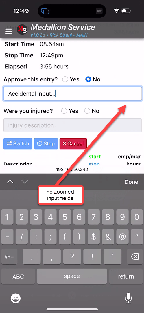
Yay!
I'm kind of miffed that I didn't know about this sooner, because this auto-zoom behavior has been one of the reasons I've been sorely disappointed in mobile Web app behavior. All that auto-zooming and forced manual size resetting is annoying as heck. It took me so long because I assumed that was just another one of the shitty iOS HTML behaviors, without recognizing the arbitrary 16px auto-zoom boundary that isn't described in any specs and required a few deep searches on SO and some Twitter feed responses.
Which approach is Best: It depends!
As I pointed out above, in my application I actually ended up using both approaches:
- Using the iPhone targeted
maximum-scale hack for a quick fix
- Using the
16px+ as the permanent solution
Clearly the 16px solution is the cleaner solution of the two and if you are starting a new application from scratch you should definitely focus on that approach. While this perhaps crimps your design style (if you for some reason need smaller inputs) in general 16px, is a pretty reasonable size for a base font size for mobile applications.
The maximum-scale hack if you decide to use it should be targeted only at iOS Safari, as Safari ignores the actual scaling implied by the tag and really only affects the auto zooming behavior. Even with maximum-scale applied, iOS can still manually pinch and zoom, while Android doesn't allow pinch and zoom if maximum-scale is applied. Hence the suggestion for selective use. This selective hack is useful as a quick fix, while you take the time to properly fix input field sizes to be larger than 16px.
Summary
Nothing new or earth shattering in this post, but I didn't know about the 16px boundary condition until recently and I felt like I wanted to write this down so I would remember and easily find it next time I run into this. The auto-zoom fail in iOS is such a bad UI experience and I've run into this so often in my own as well as other third party Web apps, that it's good to be reminded...
Zoom along, but not on any text input please...
Other Posts you might also like