Creating nice looking checkboxes and radio buttons in browsers is still kind of a pain. If you want to have spruce up checkboxes and radios in your Web applications and don’t want to rely on the crappy and differing implementations in various browsers, you have to take things into your own hands. In this post I’ll show how to use FontAwesome symbols for radio button and checkbox selectors.
I originally had been using background images for my radio buttons, which looked alright but I found out that the images would not print properly. I needed another solution so I started looking around to see if I could use FontAwesome fonts and of course you can. I found a few examples, but as is often the case there were a few complications and a few additions I had to make. This post covers all the issues I ran into.
What’s wrong with checkboxes and radio buttons?
Currently I’m working on an application that has a lot of surveys so it consists of a tons of radio buttons and checkboxes and I wanted to have a nicer and more bold look to them than the boring plain form interface provided in browsers.
For example here’s the default look for radio buttons in Chrome:
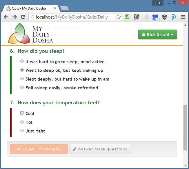
While that doesn’t look too bad the interface does vary quite a bit depending on which browser you’re using. Internet Explorer uses white background and solid highlights, FireFox uses something similar but has a particularly ugly highlight. On the Mac things look completely different and mobile apps have yet a completely different look that often doesn’t jive well with an HTML design.
Often it’s nice to have consistent look for the application regardless which device or browser it’s running and customizing checkboxes and radio buttons is one way to keep the look and feel the same across browsers and devices.
FontAwesome is Awesome
If you haven’t looked at FontAwesome before, definitely make it a point to take a look. I’ll wait here.
FontAwesome is essentially the WingDings for the Web with over 500 symbols in its font repertoire that you can easily use in a Web page by using a simple <i> or <span> tag.
A FontAwesome symbol can be embedded into text or buttons and menu pats and it’s a super easy way to add some basic imagery to your application if you don’t have designated designers creating artwork for you. To embed a symbol is as easy as:
<i class="fa fa-fw fa-envelope"></i>
or:
<button type="submit" name="btnSubmit" id="btnSubmit"
        class="btn btn-primary"
        value="SIGN IN">
    <i class="fa fa-lock"></i> SIGN IN
</button>
All sorts of common icons are provided for typically business applications and application tasks. You can even combine symbols and create animated symbols that make it super easy to create action indicators for things like downloads for example.
FontAwesome and Radios and CheckBoxes
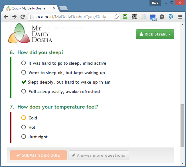
FontAwesome also includes a few different symbols for handling checkboxes and radio buttons. Below is the same form shown above created with FontAwesome symbols for the radio buttons.
Here’s the same application form on Safari on an iPhone:
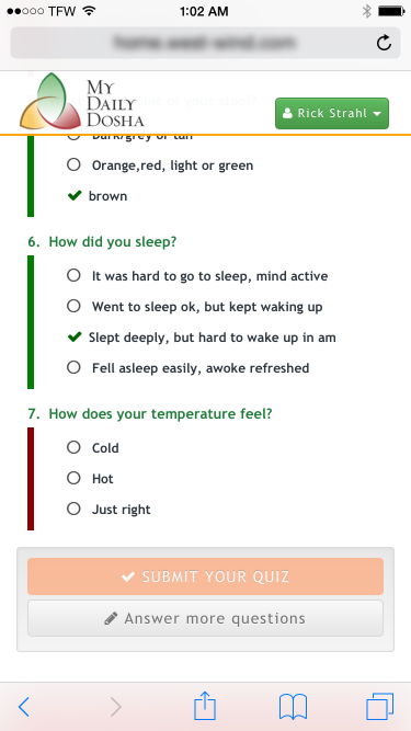
As you can tell it looks the same rather than using the iPhone’s custom radios which in this case is desirable.
You can check out what using the FontAwesome icons usage looks and feels like in this CodePen example that goes with this article.
People have been using tricks to use custom content for checkboxes and radio buttons for a while. The way this ‘trick’ works is by essentially hiding the checkbox itself, and injecting extra content in its place. You can use either static content you put into the page, or as I’ll do here, use the CSS :before selector to force extra content into the page.
One of the advantages of using fonts over images is that you’re likely already using some sort of font library like FontAwesome (or Bootstraps glyphicons) for icons, so you get the ‘images’ for free. Fonts can also resize themselves with the documents/element’s font-size so you don’t have to worry about scaling issues - as shown in the iPhone screen shot which uses a smaller font for the phone media query. If you use images you’d have to resize the image.

Yesterday I ran into a CodePen from James Barnett that shows the basics of how to use FontAwesome symbols for checkboxes which gave me a good start for my project. I ended up tweaking the original code a little and adding keyboard support after some discussions on Twitter with a few folks, so I decided to put this all together into a short blog post.
Radio Buttons
The following is the CSS used to set up the radio buttons.
Please note that I use an explicit .with-font class here to specify which radio buttons to apply this styling to so I can control which radio buttons get this treatment. If you want to do this globally just remove the .with-font class, but I recommend not to because the styling has a few requirements. This code requires a radio button that is immediately followed by the display label for the radio. If the label is not there and not immediately following the checkbox you get a missing checkbox – not desirable. Hence I want to be explicit about it.
Here’s the CSS:
input[type=radio].with-font {
    border: 0;
    clip: rect(0 0 0 0);
    height: 1px;
    margin: -1px;
    overflow: hidden;
    padding: 0;
    position: absolute;
    width: 1px;
}

input[type=radio].with-font + label:before {
    font-family: FontAwesome;
    display: inline-block;
    content: "\f1db";
    letter-spacing: 10px;
    font-size: 1.2em;
    color: #535353;
}
input[type=radio].with-font:checked + label:before {
    content: "\f00c";
    font-size: 1.2em;
    color: darkgreen;
    letter-spacing: 5px;
    width: 35px: 5px;
}
input[type=radio].with-font:focus + label:before {
    font-weight: bold;
    color:orange;
}
The CSS first hides the original checkbox using some tricky code from Html BoilerPlate (.visuallyhidden) that leaves the checkbox hidden but alive for focusing and keyboard navigation (thanks to @James_M_South for the tweak) . This is so that we can still focus the control which is handled by the last CSS style that changes the color of the control using the checkbox’s :focus pseudo selector. The second and third sections basically ‘inject’ the symbol using the :before pseudo selector which allows inserting for content before the selected control. Here the font-awesome fa-circle-thin and fa-check symbols are injected using their character codes. The checkmark is displayed with a green color to make it stand out.
So now to use this CSS all I have to do now is add the with-font CSS class to a radio button. Here’s what this radio button markup looks like as part of an Angular JS form that displays all the quiz questions in the code above:
<div class="question-body"
     ng-class="{ 'not-answered': !question.Selection, 'answered': question.Selection}">

    <div class="question-item" ng-repeat="choice in question.Choices">
        <input class="quizquestionchoice with-font"
                id="Quiz_Questions_{{$parent.$index}}__Selection_{{$index}}"
                name="Quiz.Questions[{{$parent.$index}}].Selection"
                type="radio"
                ng-value="choice.Value"
                ng-model="question.Selection"
                required />
        <label for="Quiz_Questions_{{$parent.$index}}__Selection_{{$index}}"
                class="css-label" style="display: inline-block">{{choice.Text}}</label>
    </div>
</div>
Checkboxes
Checkboxes are really very similar to radio buttons, so you can use essentially the same code – just change the type to checkbox and change the symbols to reflect checkboxes. Here’s the checkbox CSS that I use:
input[type=checkbox].with-font {
    border: 0;
    clip: rect(0 0 0 0);
    height: 1px;
    margin: -1px;
    overflow: hidden;
    padding: 0;
    position: absolute;
    width: 1px;
}
input[type=checkbox].with-font + label:before {
    font-family: FontAwesome;
    display: inline-block;
    content: "\f096";
    letter-spacing: 10px;
    font-size: 1.3em;
    color: #535353;
}
input[type=checkbox].with-font:checked + label:before {
    content: "\f046";
    color: darkgreen;
    letter-spacing: 5px;
}
input[type=checkbox].with-font:focus + label:before {
    font-weight: bold;
    color: orange;
}
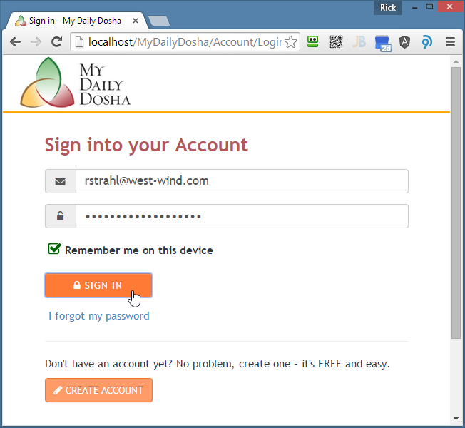
Here’s what the checkbox looks like when checked:
Accessibility
I was originally pointed at this approach by a CodePen entry I found online that outlines the basic idea I described above. But as James South pointed out quickly after I posted a link to it on Twitter:
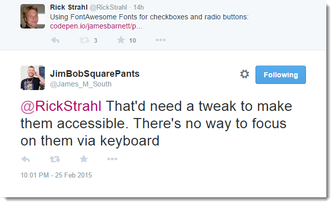
The accessibility of the original example is lacking severely – there’s no keyboard navigation or visual indicator of the selected checkbox. The original code simply hid the original checkbox, which gives the right visual appearance for using a mouse and touch device, but does not provide for keyboard navigation.
I made a few tweaks to code to visually hide the control but effectively leaving it active so that a screen reader can still ‘see’ the control. I initially used a Width of 1px and overlaid the checkbox/radio ontop of the little visible pixel. James replied with a better way using this:
input[type=checkbox].with-font {
    // using Html Boiler Plate .visuallyhidden code
    border: 0;
    clip: rect(0 0 0 0);
    height: 1px;
    margin: -1px;
    overflow: hidden;
    padding: 0;
    position: absolute;
    width: 1px;
}
And that works without any visual debris. Incidentally I’m glad this came up – I’ve used a number of different tricks to make invisible but not hide elements and this code should come in real handy for other things. Thanks James!
The other lucky side effect of leaving the control visually hidden is that you still get focus events that fire on the control so you can use CSS to hook up the :focus selector to highlight the injected content. When using the first example you can tab through the list of radio buttons and the set of radios that’s selected will be highlighted in orange. Yay!

ASP.NET MVC
While my original use case was for the quiz questions and radios in my Angular front end code I ran into some problems with some MVC Razor code. For example on the login form I originally had this Razor code:
@Html.CheckBoxFor(mod => mod.RememberMe, new {@class="with-font"})
<label for="RememberMe">Remember me on this device</label>
Unfortunately that didn’t work and the form came up without a checkbox. Why? Because MVC’s HTML helpers for checkboxes and radios create hidden fields that look like this:
<input class="with-font" id="RememberMe" name="RememberMe" type="checkbox" value="true">
<input name="RememberMe" type="hidden" value="false">
<label for="RememberMe">Remember me on this device</label>
Notice the hidden field injected in the middle which breaks the CSS selector that finds the label:
input[type=checkbox].with-font + label:before {
This selector looks for the immediate next sibling and expects a label but unfortunately there isn’t one. So the + isn’t going to work. Instead we could use the ~ selector instead and force the checkbox and label to be in their own DOM tree, which is pretty common. In my case I’m using BootStrap anyway so I have:
<div class="form-group" style="margin-left: 5px;">
    @Html.CheckBoxFor(mod => mod.RememberMe, new {@class="with-font"})
    <label for="RememberMe">Remember me on this device</label>
</div>
and for this the ~ selector works fine. I can change the checkbox selectors to:
input[type=checkbox].with-font {
    border: 0;
    clip: rect(0 0 0 0);
    height: 1px;
    margin: -1px;
    overflow: hidden;
    padding: 0;
    position: absolute;
    width: 1px;
}
input[type=checkbox].with-font ~ label:before {
    font-family: FontAwesome;
    display: inline-block;
    content: "\f096";
    letter-spacing: 10px;
    font-size: 1.3em;
    color: #535353;
}
input[type=checkbox].with-font:checked ~ label:before {
    content: "\f046";
    color: darkgreen;
    letter-spacing: 5px;
}
input[type=checkbox].with-font:focus ~ label:before {
    font-weight: bold;
    color: orange;
}
with the explicit understanding that checkbox and label need to isolated.
The other alternative is to simply skip the Html Helper and just use raw HTML:
<div class="form-group" style="margin-left: 5px;">
    <input type="checkbox" name="RememberMe" id="RememberMe"
            value="true"
            class="with-font"
            checked="@(Model.RememberMe)"/>
    <label for="RememberMe">Remember me on this device</label>
    <input name="RememberMe" type="hidden" value="@(Model.RememberMe)">
</div>
Ugly but it works.
Consolidating
Now that you can see how using fonts for checkbox and radio indicator works, here’s a more consolidated version that handles both with a little less CSS code:
input[type=radio].with-font,
input[type=checkbox].with-font {
    border: 0;
    clip: rect(0 0 0 0);
    height: 1px;
    margin: -1px;
    overflow: hidden;
    padding: 0;
    position: absolute;
    width: 1px;
}

input[type=radio].with-font ~ label:before,
input[type=checkbox].with-font ~ label:before {
    font-family: FontAwesome;
    display: inline-block;
    content: "\f1db";  /* fa-circle-thin */
    letter-spacing: 10px;
    font-size: 1.2em;
    color: #535353;
    width: 1.4em;   /* reduce bounce */
}
input[type=radio].with-font:checked ~ label:before,
input[type=checkbox].with-font:checked ~ label:before  {
    content: "\f00c";  /* fa-check */
    font-size: 1.2em;
    color: darkgreen;
    letter-spacing: 5px;
}
input[type=checkbox].with-font ~ label:before {
    content: "\f096";  /* fa-square-o */
}
input[type=checkbox].with-font:checked ~ label:before {
    content: "\f046";     /* fa-check-square-o */
    color: darkgreen;
}
input[type=radio].with-font:focus ~ label:before,
input[type=checkbox].with-font:focus ~ label:before,
input[type=radio].with-font:focus ~ label,
input[type=checkbox].with-font:focus ~ label
{
    color: green; /* highlight both box and label */
}
So there you have it. FontAwesome checkboxes and radio buttons are pretty sweet and pretty easy once you have some simple boilerplate CSS in place…
Resources
Other Posts you might also like